Alexis Smith
Snake Path (1992)
Location: East side of Geisel Library to Warren Mall
Audio Tour
Alexis Smith 1949 - 2024
We are saddened to hear about the passing of Alexis Smith, Stuart Collection artist.
L.A. artist Alexis Smith, a pioneer of art fusing image and text, dies at 74
Alexis Smith, the clever, much-exhibited Southern California conceptual artist, has died at 74.
Alexis Smith, Legendary Los Angeles Artist Who Pierced Hollywood’s Veneer, Dies at 74
Smith was a key artist of the Los Angeles scene whose collages explored celebrity culture and Californian mythology.
About the Artist
Since the 1970's, Alexis Smith was known for innovative collages in unique or exotic frames, which pair found objects with backgrounds such as maps, vintage magazine covers, and amateur paintings. Smith combined fragments from the mass media like magazine covers or dust jackets of the 1940s with a wide range of kitsch and found objects. Often, she organized several collages into sequences, implying a coherent narrative. As in a film, related fragments of text (almost a "soundtrack") link one collage to another. Smith also painted large motifs directly onto a gallery's walls and then hung her smaller framed works on this mural-like background. In this way she succeeded in transforming the art space itself into a collage. Smith expanded this impulse to work environmentally, doing many large-scale permanent installations including terrazzo floors for the Los Angeles Convention Center and the Schottenstein Sports Arena at Ohio State University in Columbus.
Smith lived and worked in Los Angeles until her death in 2024. Her work makes a major contribution to the widespread artistic effort to articulate and reevaluate the ideological formations of mass culture, and the collection and production of so-called classical knowledge.
About the Sculpture
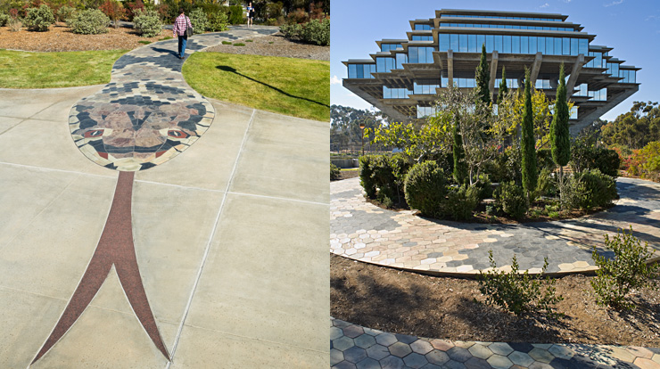
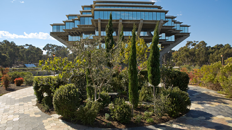
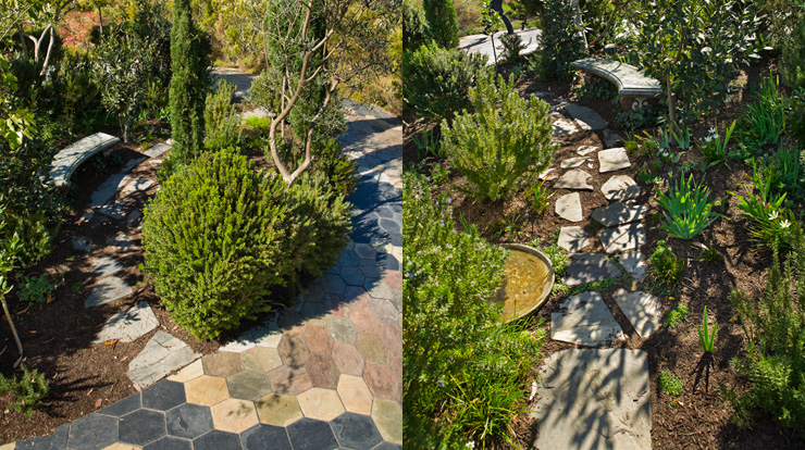
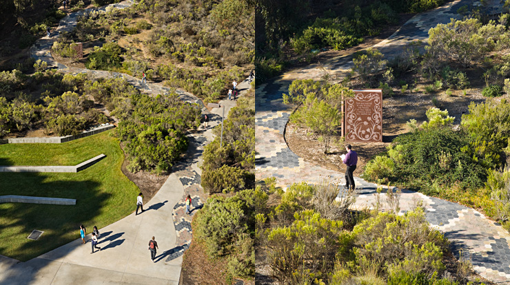
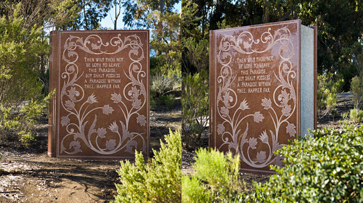
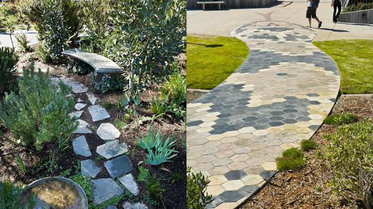
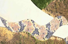
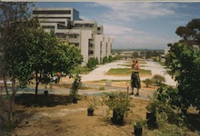
Smith's work for the Stuart Collection, Snake Path, consists of a winding 560-foot-long, 10-foot-wide footpath in the form of a serpent, whose individual scales are hexagonal pieces of colored slate, and whose head is inlaid in the approach to the Geisel Library. The tail wraps around an existing concrete pathway as a snake would wrap itself around a tree limb. Along the way, the serpent's slightly crowned body circles around a small "garden of Eden" with several fruit trees including an apple, a fig and a pomegranate. There is a marble bench with a quote from Thomas Gray: "Yet ah why should they know their fate/When sorrow never comes too late/And happiness too swiftly flies/Thought would destroy their Paradise/No more, where ignorance is bliss, tis folly to be wise." The path then passes a monumental granite book carved with a quote from Milton's Paradise Lost. "And wilt thou not be loathe to leave this Paradise, but shalt possess a Paradise within thee, happier far."
These pointed allusions to the biblical conflict between innocence and knowledge mark an apt symbolic path to the University's main repository of books. The concept of finding sanctuary within oneself — outside the idealistic and protected confines of the university — speaks directly to the student on the verge of entering the "real world."
Essay
Alexis Smith, Snake Path, 1992
Los Angeles artist Alexis Smith mines America’s soul, our psyche and mythology. In the 1980s she was known for innovative collages combining fragments from popular culture—magazine covers, 1940s dust jackets, kitsch, and found objects—and playing on our imagination of the recent past, works that she collages into visual narratives. Like Joseph Cornell, she combs flea markets and thrift stores, collecting and organizing her myriad acquisitions into a library of objects in her studio from which she drew. She saw the potential for collage to make leaps in scale, and so she also painted large murals directly onto the wall, hanging smaller framed images over these painted backdrops and then also filling the room with objects, which effectively transformed architecture into a collage. In 1983, she transformed an entire two-story theatre lobby in Grand Rapids, Michigan, into a narrative drama using images derived from local history and the Art Deco style of the building, and later in the ’80s she moved into the landscape, so it was not surprising that her name came up in a Stuart Collection Advisory Board meeting in 1986.
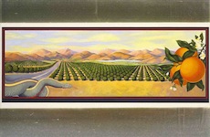
In April of that year, Alexis came to campus and we walked around together. At the time, she was winding up a series of works related to the idea of paradise with a huge sixty- by twenty-foot mural for the lobby of the Brooklyn Museum. This 1987 mural became part of the Stuart Collection in 2018, and it was the source inspiration for the work she proposed. It was painted in a style evoking old fruit crate labels and California postcards, depicting a vast orange grove with giant fruits and blooms receding into a purple-hued expanse of mountains. Running through the grove is a disturbingly vacant highway that metamorphoses in the foreground into a gigantic snake. This Eden is in trouble. Alexis thought a snake could be both a real path and a metaphoric one, leading to revelation, knowledge, and self-awareness—the tempting serpent of knowledge from the Garden of Eden. Like her immense mural, this idea could touch on myriad associations, from California as a paradise found, then lost, then perhaps found again, and on literature and knowledge as sanctuary.
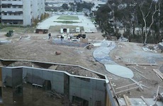
As it happened, the Central Library was about to undergo expansion and there was an architectural model of the building proposal on display in the lobby. Looking at the model, Alexis saw an opportunity. By January of 1988, she had made a wonderful preliminary drawing of a path in the shape of a snake, connecting the plaza to the west up a steep hill to the library terrace. At the base of the slope, the tail of the snake wrapped around a concrete path. It wound up the hill, passing a large granite book along the way, encircling a small garden at the top; and then the head, with tongue extended, almost touched the library terrace. The hillside itself had to be imagined, as it would not exist until the new library expansion project— an underground building—was completed.
We met with the library administration and the building committee who were enthusiastic. It was unusual for the Stuart Collection to meet with such excitement, but our timing was fortuitous, coinciding with the library expansion. UC San Diego agreed to let us prepare the contour plan for the hillside, and they agreed to underwrite the basic concrete substrate, the surrounding landscape, and utilities.
The plan was presented to the advisory board in January of 1989. Some members were ambivalent; foundation resources were running low and money was becoming a real concern. It was also felt that if the path weren’t fully detailed and resolved, it could end up being quaint. Knowing Alexis, we assured them that there was no chance that any detail would be overlooked or that any compromise would be made; she has always been ferocious about perfect execution of her ideas, and fearless in her willingness and ability to apply the magic of collage to the scale of architecture and landscape. While she had never worked on something like this, she had what it took. After a lengthy discussion they agreed to go ahead.
As we went forward, and thanks to a major exhibit organized by Richard Armstrong at the Whitney Museum that traveled to LAMOCA, as well as a focus show at UC San Diego, both of which included drawings of the Snake Path, enthusiasm for the project grew. But the cost estimates also went up. In March of 1991, Mary wrote to the board that Snake Path had taken on a life of its own and “was coming along beautifully…we just haven’t figured out how we will pay for it all.” It is not unusual to arrive at a crisis of confidence during the process of commissioning a work. As often happens in projects of this scale, there comes a point when you just have to get going, with or without the full commitment of monies, and expect that the momentum will bring in the rest of the funding. Before we completely despaired, Jim DeSilva agreed that we should proceed and came through with additional funds.
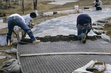
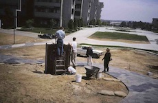
After contract negotiations we retained the Klaser Tile Company, whose expertise was central to the quality of the work, because this was not a project that could be solved in the studio or on the drawing board. But two things critical to its success had been solved. One was—how can a pathway, which normally is flat across and banked into a slope, feel like the body of a giant snake? The obvious answer was to make it rounded, and while this violated normal practice, it actually provided for areas that felt more stable as you walk up. You just have to pay attention to where you are in relation to the shifting slope, which, in turn, increases one’s awareness of the rounded back of it. Another problem was how does one make a tiling that feels like scales, and is not only directional, but can also shift directions with the snake? Alexis came up with a solution for that one by finding references (just as she did with her collage narratives)—in this case, looking through books about mathematical tilings. An elongated certain hexagon will both tile and shift direction in sixty-degree increments, ideal for the undulations of the snake. So one has a sense of roundness as well as directionality, and enhancing this were three types of natural slate (from China, Africa, and India) that Alexis painstakingly laid out, in three sizes, in the approximate pattern of a rattlesnake. When laid out across the hillside, the snake as designed proved too long and circuitous, and so Alexis cut forty feet out of the length. When Klaser began the work of laying the multicolored slate tiles (wearing T-shirts they had printed saying “Team Snake”), they were able to make continued adjustments in the field, and the work seemed to grow organically. Big and small decisions were made every day, consistent with Alexis’s maxim that the more care is given to detail, the more everything “belongs.”
Jim DeSilva and others saw Snake Path as a turning point in the collection’s history. It established a scale, integration, and critical mass. It became possible to see the path as celebrating the library and learning; the project made a leap in relating the collection directly to the university. The academic community easily grasped the work’s literary references, and also linked it to Bruce Nauman’s Vices and Virtues, which is visible from the snake at night. And students make these connections, too, on a very personal level, seeing intimations of morality, desire, strengths and failings, and the sense of home—most evident in Fallen Star by Do Ho Suh, which now hovers overhead opposite the Nauman—and of losing that memory, and finding it again.
The Garden of Eden, squeezed in the grip of the giant snake, is a miniature landscape including a pomegranate (etymologically a seedy kind of apple, a pomme grenade) a fig tree, palms, and an apple tree. A reminder of innocence and bliss appears on a granite garden bench, on top of which is engraved a quotation from Thomas Gray’s poem “Ode on a Distant Prospect of Eton College”:
YET AH! WHY SHOULD THEY KNOW THEIR FATE
SINCE SORROW NEVER COMES TOO LATE,
AND HAPPINESS TOO SWIFTLY FLIES.
THOUGHT WOULD DESTROY THEIR PARADISE
NO MORE, WHERE IGNORANCE IS BLISS,
‘TIS FOLLY TO BE WISE.
The quote is bordered by period etching of Adam and Eve in the garden on one side and a snake on the other. Looking east from the garden out over the canyons toward the distant mountains, with the huge spaceship-like library looming behind, this feels like a small island in the arid vastness of southern California.
The book was the last element to be added to this grand scenario, but it is the first to be encountered on one’s pilgrim’s progress up to the library. It is inscribed with Art Deco designs taken from a copy of Milton’s Paradise Lost. It also has the correct library call number on the spine, just in case a visitor on the way to the library might want to read more than the quote on the front:
THEN WILT THOU NOT
BE LOTH TO LEAVE
THIS PARADISE.
BUT SHALT POSSESS
A PARADISE WITHIN
THEE, HAPPIER FAR.
The first touchstone one encounters on the way up the path, the book sets up the metaphor of the university as a paradise from which students will eventually be cast forth, to find—or make—a paradise of their own. Alexis has taken a cultural myth and given it new meaning by casting it into the real world of physical materiality and experience.
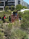
This work is all about the physical experience of walking it: it feels so different from the usual flat path. The pattern, colors, and sheen of the slate are snakelike, and the way the path slopes with and against the hillside makes it unlike any other path. The hill is planted with native species like the natural canyons beyond that weave into the campus here. Alexis wanted it to be as if the snake had come up out of the canyon, where rattlesnakes actually live, and so the wildness of nature and the presence of culture are brought together.
It had been six years since we started on this journey when the work opened in October 1992. Alexis gave a lecture about her Snake Path experience, sharing great insight and a lot of acerbic asides. Afterward, a few of us were able to go up in a helicopter to get an aerial view of Snake Path. Alexis exclaimed, “Why, it looks just like the drawing.” For a brief moment we were back at the beginning.
Interview with the Artist
Alexis Smith Interview with Joan Simon
Joan Simon: Though you've used various snake images before—in your 1987 Sidewinder necklace and your 1990 mixed-media collage Jack, to name but two—the serpent in your Stuart Collection project seems to come directly from the one in your 1987 installation at The Brooklyn Museum, Same Old Paradise.
Alexis Smith: It did actually. During the time I was installing the piece in Brooklyn, I had a dream of a snake you could walk on. It was obviously related to the piece in Brooklyn, but it was the first time I ever considered the possibility of making a big snake for the Stuart Collection. Mary Beebe had asked me to do something; there was a possibility of doing some kind of plaza, or something for one of the science buildings. I had come down and looked around, but it hadn't
really gelled. They were going to do an underground addition to the main library and they were going to create an artificial hillside over the top of it, which eventually became the site of the snake. It was a perfect site, of course, because of the biblical idea of the snake and the tree of knowledge, and because the idea of the snake winding down the hill was much better than if it was just going over something flat.
JS: Would you talk about the different ways you've used the snake before, and how those works relate to Snake Path?
AS: Once I start thinking about some particular image, or even some particular text, it's easy for me to reuse it again, because the more I think about it, the more I can see different things it could mean or ways I could use it. I used it initially as the train that becomes a snake [Sidewinder]. I guess I was initially drawn to the sinuous shape of the snake just as a thing in the world, its serpentine nature. That was the first draw. Then I got really interested in the scale part—the surface texture. I used it in conjunction with tire treads a few times. They were parallel in a very visceral way. First, I used bicycle tire treads as a printing device for the snake outline in Asphalt Jungle [1985], and then truck treads formed a slash across the snake in Jack. The Holy Road [1988] had little snakes on it and tire treads carved into the frame. Then, for Same Old Paradise, the road actually becomes the snake.
JS: If you start your journey along the Snake Path at the bottom of the hill, you soon come upon a monumental granite book.
AS: It's Milton's Paradise Lost. “Will thou not be loathe to leave this paradise but shalt possess paradise within thee, happier for.”—which I take to mean as consolation for leaving Eden, and the inevitable loss of innocence and protection that goes with it, you have this knowledge that you take with you, that keeps you in good stead for the things that happen to you in life.
JS: The seven-foot-high granite book is startlingly out of scale.
AS: The thing about it is that everything is out of scale. It's a formal choice. I couldn't put a little tiny granite book there without having it look like a cemetery.
Actually I don't see you starting at the bottom. For me, I think of you starting at the top because the research library was the original piece of architecture, and that was unchanged. For me, the piece probably starts at the head. But I don't really think of it having a beginning or an end. It goes both ways.
JS: The volume Paradise Lost was a book that was given to you by artist Italo Scanga.
AS: As a wedding present. I actually took a lot of details from that book. The curling serpent on the spine comes from the Scanga book, and also the Gustave Doré etching of Adam and Eve, which I used on the bench. The Dewey Decimal number is the one from the real research library, although I don't think they use this number anymore. And then there's the loop.
JS: The snake curls around itself midway up the path and encloses a separate garden.
AS: The loop is as close as we could come to treating the Garden of Eden literally, as they did in the Middle Ages, like it was a real place. We researched what people thought was in the Garden of Eden. In the original biblical conception, it was pomegranates, not apples. Apples were a European perversion; they couldn't grow pomegranates because it wasn't warm enough. Anyway, there is a pomegranate tree in my Garden of Eden.
JS: Within your Garden of Eden is a marble bench, inscribed with the Doré image of Adam and Eve and also with another poem.
AS: There's the ignorance is bliss text—I couldn't quote it for you—although it's the flip side of the other Milton quote, another country heard from, and it's from Thomas Gray.
JS: We can check the bench and cite it here.
AS: It reads:
YET AH! WHY SHOULD THEY KNOW THEIR FATE?
SINCE SORROW NEVER COMES TOO LATE,
AND HAPPINESS TOO SWIFTLY FLIES.
THOUGHT WOULD DESTROY THEIR PARADISE.
NO MORE; WHERE IGNORANCE IS BLISS,
'TIS FOLLY TO BE WISE.
JS: The Stuart Collection works are referred to as commissioned sculptures, and for this book, appropriately, I think, “landmarks.”
AS: They are not traditional sculptures in the sense you usually think of—a sculpture as a big thing that's attached to a base, whether the base is a plaza at its most grandiose, or an actual base. I think that's what most people think sculpture is. I don't know what you'd call things that exist in space if you don't call them “sculpture.” I think if you want to qualify it and call it “installation sculpture,” that's always fine.
JS: How you structured the snake, its skin, is crucial to the experience of walking the path.
AS: The snakeskin is made out of three colors of slate. Each of the scales, or tiles, is cut out of a twelve-inch square. In order to make those shapes, you have to make seven more cuts. There are 7,000 tiles and so there are 49,000 cuts just to make the snake scales. The thing about the path is that the imagery only functions at the macro level. When you get to making things like that, the how to make it is way more important than the what it is. If you're a conceptual artist and you're making photographs, the what it is or the material form is way less than the idea of it. But when you're making something that has to fit into the master plan of the university, and that's ten feet wide and six-hundred-and-some feet long, that has to be crowned and in a nonrepeating pattern, then you're talking about something where the idea is the broad-strokes part. The actual physical making of it and the process, getting over all the hurdles, that's the hard part.
I'm actually really good at imagining things large. I'm one of those people who think if it looks good small, it'll look really good large. That's just my theory of public art. If it fits into the plan, and it really fits in so seamlessly and is so custom-made that it can't be off by a centimeter, then when you actually make it, it'll be so integrated that it'll blow people's minds—so perfectly part of your experience of where you are. It has to be a perfectly chosen image; it has to be the right thing for the right place. Every little detail of it has to be worked out in terms of the physical making. That's where I put my attention. I don't put my attention toward how the metaphor functions—or the conceptual details, or any of that, which is weird because in my studio work I do all these small things, and those little nuances are really important to me. But when I do this really big stuff, the emphasis shifts to how wonderful the physical experience is because that's the thing that you care about when you're walking on it. The fact that you could put it in the metaphorical context of the university, and understand how the image works and what it means, that makes it a work of art. But it takes brainwork to figure that out. That part takes five minutes. The other part, the physical realization, takes six years.
JS: You've said that the UCSD piece was interesting for you because “the form and content are the same.”
AS: We made the hill. The hill was graded to fit the snake; the snake was then adjusted to fit the hill. The scales are in a nonrepeating pattern, and one of the hardest things about it, was that I couldn't do the snake until I found the tile shape. I finally found the shape in a math book about “tiling,” which is basically how different shapes fit together, the history of tile shapes. And the only kind of tile that would work for me was a tile that looks kind of like a snake scale. That ruled out 90 percent of the tiles. The second thing I needed was a tile that could change direction. They had to change direction in order to get the zigzag of the curves. These gave you a niche so you can lay them on a diagonal. That made the snake. Until I could change direction, I couldn't do the piece.
JS: When you walk the path, you feel each scale underfoot, and especially become aware of how the snake back rises in the center; the middle of the path is higher than the edges.
AS: It's crowned. That wasn't my idea. That was actually the landscape architect's—Andy Spurlock and his partner Marty Poirier—idea and it was a brilliant idea. As soon as he said we could crown it, I knew that was right.
JS: Six years is long, even given the fluidity of the Stuart Collection's programming.
AS: These public art things go on for a long time. If it was small enough to just be insinuated into a building—and believe me, insinuation is the right way to think about these things—then you don't have to have as many people sign on to it. But in something like this, it has to be in the master plan of the university. The piece wraps around the sidewalk and goes into the plaza. It has to be part of the sidewalk, and be part of the circulation for the whole campus. Every one of those things represents a battle. I want the head to be inlaid into concrete, but the landscape architect doesn't. Or—after the snake was accepted by the university, and it was part of the master plan—there was a time when the landscape architects for the library decided my snake tail was supposed to wrap around an amphitheater, and I said, “Forget it.” It's a cross between politics, architecture, and art. A hybrid. It's not like working in your studio. It’s much more—I don't even know how to describe it. It's just that so little of it is the idea, and so much of it is about not only the implementation but also the tenacity—on my part and of the Stuart Collection—to establish that these are the limits. Either we're going to do it this way, or we're not going to do it, and trying to win every little battle. It has to be this way or it won't look good. That's it.
JS: UCSD is a relatively new university, and a part of the statewide university system. I know you went to UC Irvine when it first opened, and its newness and open-endedness were very important to you.
AS: It was a mud hole when I went there; it was brand new. But I always think that was part of the attraction. I mean, like America versus Europe. There's the attraction of a place where change is still possible. Where the things that are there are not so important that new things can't supplant them. And that's the attraction of the New World versus the Old, the West Coast versus the East. It's very hard to change things where everything is wonderful, and has a tradition.
JS: In talking about Irvine you mentioned that such a young university, without significant facilities, was important for bringing in the best faculty they could—working artists, visiting critics. In some ways I think of the artists working on site at UCSD, and finally the presence of their works speaking for them, in a relatedly vital way.
- That was one of the most fateful and luckiest non-decisions that I ever made. For absolutely no reason, on a whim, I went to Irvine, and it turned out to be the most important decision I ever made in my life. Bob Irwin and Vija Celmins were my teachers, but I also had Ed Moses and Bruce Nauman, and there were a lot of visiting critics. It was a crucible for young artists.
Bob Irwin was probably my most important teacher. A life-long friend. He has consistently been there. The support was most useful when I was young and weird compared to everybody else, incredibly unfashionable in the years of minimalism.
JS: Nauman and Irwin are now also your colleagues with works in the Stuart Collection.
AS: That is true, and Bob is a colleague of mine at the Getty, too. I did a big painted mural project at the Getty. The theme of the piece is taste—the convergence of conceptual and aesthetic taste. I used as an image an apple—as presumably the first taste. The first instance of tastelessness, behavioral tastelessness. One fragmentary part of the Snake Path extruded into the Getty.
JS: A number of large-scale permanent installations by you followed Snake Path. Are they related in some way?
AS: One of the important things about my really big-scale pieces—this piece, the LA Convention Center, and now the Schottenstein Center, my Sports Arena in Ohio—and the thing I like the best about them, is that you can't see them all at one time. If you look at all these pieces in a drawing, you can immediately see what they are, but they're so large that you can never in real life get back and see the whole image. There's a perversity of the physical, of the architecture, of the way it is. You can't ever deal with it the way you deal with a painting or a drawing, something where you can see the whole thing.
JS: It seems there are places in the library for example, from which you can see the Snake Path in its entirety, if not experience it kinetically.
AS: I think if you go up to the top of the library you can see most of it—there are a number of photographs shot from there. I remember the day that it opened, the DeSilvas took me up in a helicopter. And I just could not get over how much it looked just like the drawing. It was the weirdest experience in my life because I was seeing it small again like my first conception of it.
